
Mobile Surveys 101: The Good, The Bad, and The Ugly of Question Writing
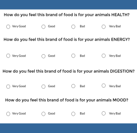
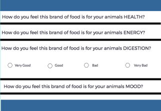
So far, we have focused on the text of your survey, but questions and answers are only half the...
3 minute read